Let’s face it – conquering our daily to-do lists isn’t usually the highlight of our day, and it often feels more like a chore than a choice. So we decided to create a gamified task manager that breaks monotony and adds a dash of fun to our tasks.
Objective Drive user engagement through customization, positive feedback loop, and motivating streaks that encourage consistent usage
My Role Designer, Testing
Duration 12 weeks
The Challenge
How Might we prove that gamifying will help people stay engaged and reduce procrastination?
By incorporating game-like elements into activities, there is a potential to boost motivation and make work more engaging.
Survey Results
In order to understand the problem, and the users needs we conducted a survey using Google Forms and got 26 people to answer
Do you keep track of your pending tasks?
How likely are you to try a task management app that incorporates game elements to motivate you?
Key Findings
Users currently use the Reminders app, Notes and Google Calendar to track todos
Users Lack discipline in managing their tasks effectively
Users struggle with task time estimation, often taking longer to complete tasks than expected
Persona
Problem Statement
A student who feels overwhelmed with the amount of tasks to be completed needs to find a way to stay on track, but is not motivated.
Prototyping
Instead of having different pages for the checklist and the game aspect, I decided that it would be better to have it all in the same page so the user knows the connection between the character and the tasks.
Task: Swipe up and complete a task
Sketches
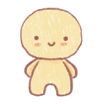
The user can complete tasks to gain points which then will allow them to buy items for their pet. This was our solution to help people stay consistent and interested in task management.
Home page where the user can see their character, how much money they have and if they swipe up they expand the lists section.
Buy food by clicking the food icon on the home page. This pop up will show the food you can buy.
Buy clothes for your character by clicking the clothes icon in the home page. This pop up will show you all the clothes you can buy.
Your character can get sick and you will have to give it medicine to make it feel better.
Low-fi Wireframes & Testing
This was the low fidelity prototype we created based on our user flow, this is what we used to test the swipe up aspect of the app.
User starts at the home page
Swipe up to expand the lists section
User goes to the “Homework” list
User checks off the “Social Studies Assignment” task
Useberry Testing Results
TASK Check off the “Social studies Assignment” task
INSTRUCTIONS
Swipe up on “My Lists”
Select “Homework”
Check off “Social Studies Assignment”
INSIGHTS & CHANGES Although the instructions said to “swipe up” some users tapped on the lists part.
Through the clicks we can see that people are interested in the character aspect of the app.
In Person Testing Results
Two participants between ages 30 to 34 years old
TASK Check off the “Social studies Assignment” task
KEY FINDINGS
Participants found the gamified elements, such as coin collection and character customization engaging and motivating.
Both participants expressed how much they like the divided screen. They want to see their character at all times.
INSTRUCTIONS
Swipe up on “My Lists”
Select “Homework”
Check off “Social Studies Assignment”
Changes & Iterations
Made the character the main focus as that is what people were more interested in
Instead of taking over the whole screen, we overlay so the character screen is still visible
To add more interactivity to your pet we thought to add a feature reminiscent of the “Tamagotchi” toy from the 90s
Game Mechanic Changes
We will add a feature for the user to be able to name their pet in the beginning. This will add further attachment to the character.
To encourage people to consistently use the app often, they will now start with an egg which will hatch once they have finished a pre-determined number of tasks.
We reduced the amount of points given from completing a task from 100 to 50.
Limited the quality of clothes the player can buy, instead the player will now pull for rare clothes and appearance changes.
To get pulls the player must have a streak of tasks completed. 7 days of consistency will give the player 1 pull.
The items that the player can pull will change every 2 months. This will encourage the players to continue to play as new items will always be available.
Hi-Fi Usability Testing
Task #1
Add a new reminder in the “Homework” list
100%
Success rate
Task #2
Open presents and customize your pet
85%
Success rate
Next Steps
More in depth user testing to improve the game aspect
Create more assets and interactivity
Implement eye catching motion graphics to keep people engaged